

Get Instant Pricing, availability and sales conversion insights from retail channel

Where to Buy Solutions
Expand Retail Coverage And Get Sales Insights
I started working for the company in 2021 and entered a fast-paced, B2B and B2C environment. By bridging the gap between retailers and brands, the company’s main product improves the purchasing experience for all kinds of customers. We obtain thorough information about brand products by using retailers’ data feeds or by crawling their websites.
A widget that allows users to browse products from various retailers is then created using this data and integrated into marketing campaigns, social media platforms, and brand websites. The B2C side of our platform is represented by this feature.
Our advanced tracking system also keeps an eye on how users interact with the widget and tracks the purchase process all the way to the retailer’s website. The information gathered is fed into a comprehensive reporting system that gives brands information about regional sales trends, retailer performance, product performance, and more. On the business-to-business (B2B) side, we offer reports and analytics to assist brands in refining their tactics.
500+ Global Clients

6000+ Global Online & Local Retailers

First Thing First!
General Refinement
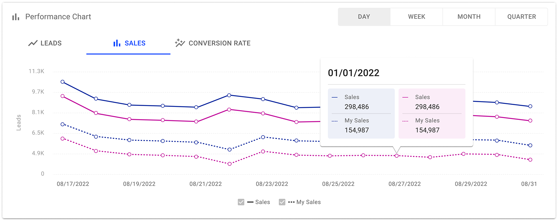
The outdated reporting platform was among the first difficulties I ran into. Users found it difficult to extract valuable insights from the previous system due to its lack of efficiency, clarity, and modern design principles.
Redesigning reporting structure and its overall visual presentation was my first significant project. After investigating and testing out several design options, we determined that Material-UI (MUI) was the best design system. MUI provided developers and designers with ease of use, guaranteeing a seamless implementation process.
More significantly, the learning curve was lowered because a large number of brand users were already accustomed to MUI’s interface.
The user experience was greatly enhanced by the switch from an antiquated dashboard to a sleek, contemporary MUI-based platform, which made data visualization and retrieval much easier.
Hatch Dashboard New Look!

MUI Design System
Designed the interface using MUI for a consistent and scalable user experience

DevExpress
Used DevExpress for high-performance data tables in complex interfaces

D3.js
Created custom data visualizations using D3.js for dynamic insights
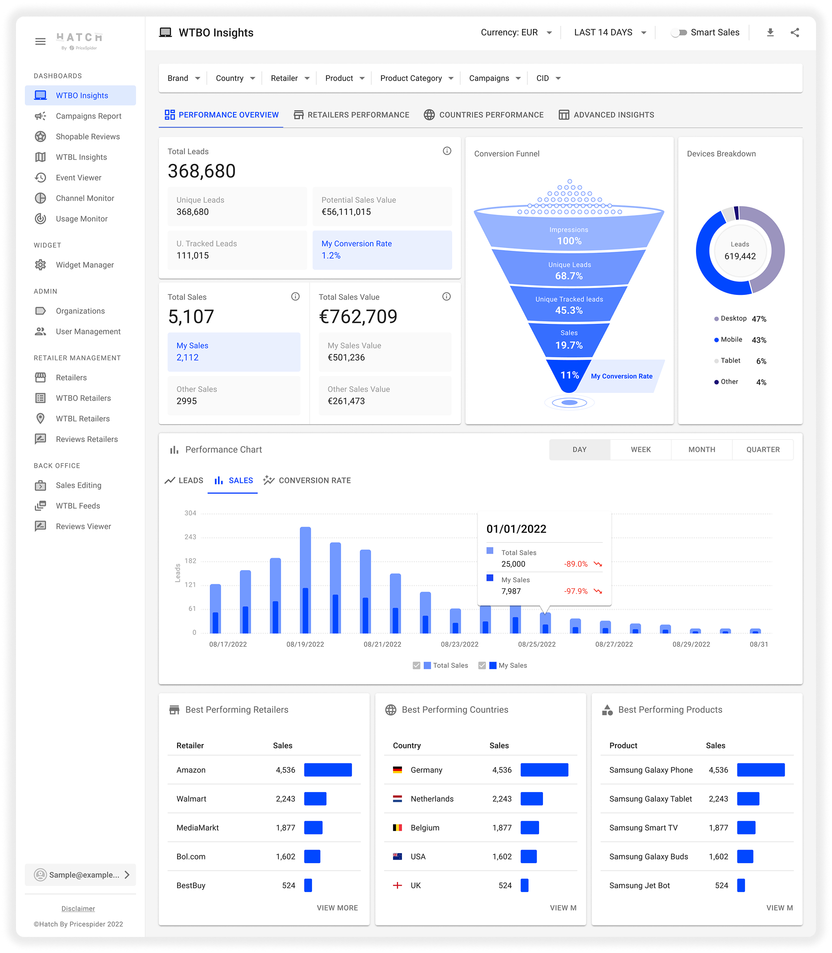
Country Performance

Project #2
Dashboard Revamp
After the redesign of the reporting platform was successful, I started my second big project, which was to improve the dashboard for actionable insights. Direct communication with important customers, such as Samsung, Intel, Sony, Microsoft, and Etna, was required for this.
I performed a number of interviews under the direction of the Customer Success Management (CSM) team in order to obtain firsthand knowledge of their expectations and pain points. Although clients could retrieve reports from the system, we found ways to offer more in-depth information that might help them make decisions.
We found a need for a more thorough retailer reporting system and comprehensive country sales reporting after much discussion and analysis.
Retailers Performance

Global Filters

2 Dimensional Report
An advanced insights table with two-dimensional filtering features was requested by clients. For instance, a brand user might want to examine the top-selling items within a retailer based on how many sold, or view a ranked list of the top-performing retailers in a specific country based on sales value.
We wanted to transform the dashboard from a straightforward reporting tool into a platform for strategic decision-making by adding these features.
Several iterations were used in the design process to negotiate technical feasibility, user needs, and best practices for data visualization. I made sure that our design solutions were both technically sound and easy to use by collaborating closely with developers, product owners, product managers, and data engineers. In order to improve the experience, each iteration featured feedback loops, back-and-forth conversations, and adjustments.
Advanced Insights

2 Dimensions

Shoutout to the team!
After approval of the final designs, we continued with the implementation stage. To ensure accuracy, performance optimization, and a smooth integration with the current structures this required careful QA testing. For a polished final product, finishing touches were added, such as improvements to the data visualization and UI. These improvements had an immediate impact. One of the CSMs gave the team positive feedback, emphasizing how well the clients responded to the updates.

As I look back on my journey so far, I can see how UX can be extremely important in turning complex data-driven platforms into easily navigable, user-friendly tools. My work on the dashboards for insights and reporting was only the first step. I can’t wait to keep creating experiences that provide brands the insight they need to make better choices in the future. These projects’ success has strengthened my conviction that design, teamwork, and constant iteration can lead to significant changes.
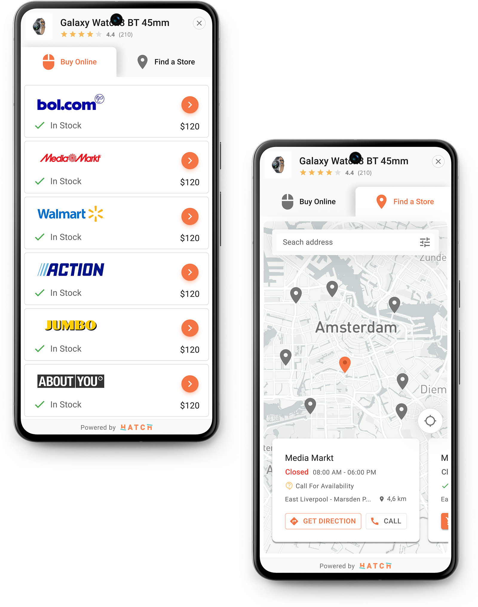
Widget WTB Online

Widget WTB Local

Project #3
Widget Variations & Usability Improvements
The Where to Buy (WTB) Widget collects availability and pricing from several retailers directly on the product page, giving customers a smooth online shopping experience.
For a specific product, users can easily compare retailer options, pricing, and stock status without ever leaving the page. In addition to a noticeable call-to-action button such as “Buy Now” or “View,” each retailer entry is labeled with a “In Stock” or “Out Of Stock” status.
The Hatch widget offers both online and local store options based on the user’s location. This flexibility allows users to choose the buying method that suits them best. Whether they prefer the convenience of online shopping or want to explore physical stores, the widget supports both experiences.

Online / Local
Designed a unified ‘Where to Buy’ experience for online and local retailers

Desktop / Tablet / Mobile
Designed a fully responsive WTB widget experience across all devices

Embedded / Lightbox Modes
Developed the WTB widget in embedded & lightbox formats for varied contexts
Widget states and variations

Hatch Dashboard New Look!

Benchmarking
I researched what other businesses like ChannelSight, PriceSpider, ChannelAdvisor, Samsung, and MikMak were doing in order to improve our widget. I looked at their widgets to find out what features, such as how they display prices, stock information, or layout options, worked and what didn’t. I now have a clear understanding of customer needs and areas for improvement.
I selected the best ideas from the data and used them into our own widget. This enabled us to make improvements to the way the stock is displayed, the layout’s responsiveness on mobile devices, and the ease of buying options comparison. Our goal was to keep up with competitors while making our widget more modern and user-friendly.
Benchmarked competitor websites—key insights captured in annotated screenshots

Online Retailers &
Local Stores
When users choose to buy online, they can easily compare different retailers offering the same product. They can see prices, availability, and delivery options — all in one place. This makes the decision-making process faster and more informed.
For those interested in visiting a store, the local store finder is a key feature. It displays nearby stores on a map and lets users see which locations have the product available. This in-person shopping option is especially useful for those who want to compare products hands-on or need the item immediately.
Each store listing includes detailed information like directions, the option to call the store, opening hours, address, social media links, and even ratings and reviews. With all of this in one place, users can easily decide where and how they want to shop.
Online & Local Widget on Mobile Screen
Online Card Variations (Desktop)

Online Card Variations (Mobile)

Local Cards

Local Card Variations

Project #4
Comparison Feature
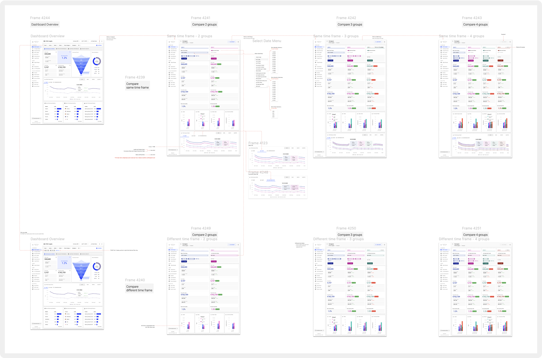
I figured it was time to bring in certain new ideas after completely revamping the dashboard and giving it a more modern look. A comparison feature that would enable users to quickly compare metrics such as product impressions, leads, sales, and sales value within a chosen time frame was one idea that caught our attention. My project manager and I discussed the idea, and it turned out that the CSM team had already gotten similar feedback from clients. I only needed that confirmation to get going.
I started by detailing the main idea and considering how to integrate this feature into the current dashboard design without overwhelming the user. To make sure it felt like a logical extension of the platform, I experimented with various placement choices and user interface designs. In order to better understand what customers would be expecting from such a feature, I spoke with a number of the Customer Success team members. I then used their feedback to improve the functionality.

Flow Screenshot From Figma
Comparison feature usability test
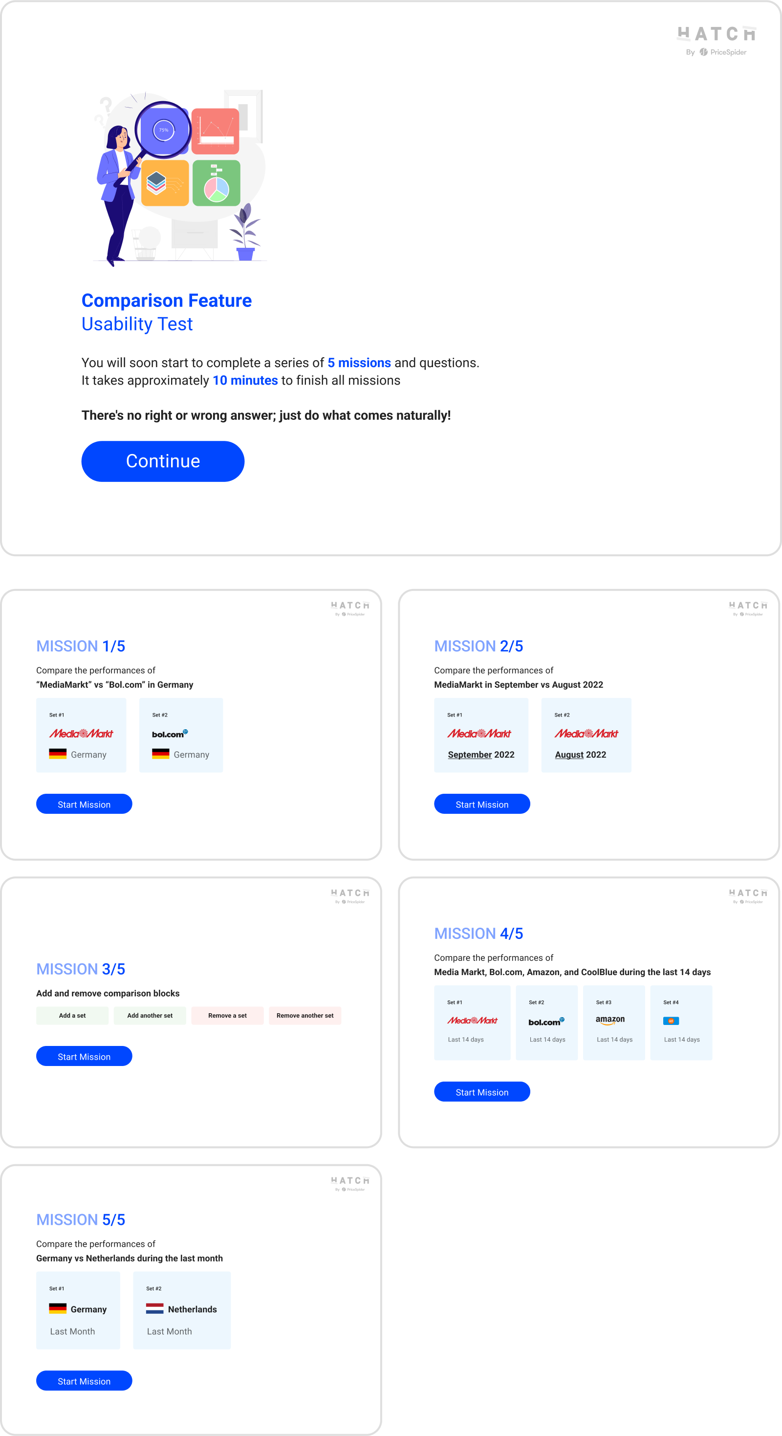

Usability Test With CSMs
Once I had a clear direction, I completed the designs and went over them with our developers to make sure they were feasible and compatible with the data structure of the system. After that, I planned a usability test and gathered 23 internal participants, primarily from the product and CSM teams, to go over the experience and give feedback. I was able to find and address some minor issues that would have otherwise affected usability thanks to the test, and those adjustments significantly improved the outcome.
Aggregated View of Leads / Sales / Sales Value / Conversion Rate

Aggregated View of Leads / Sales / Sales Value / Conversion Rate

A Feature So Good,
Clients Asked for More
One of the most appreciated dashboard updates after launch was the comparison feature. In addition to actively using it, clients began asking for comparable features for Campaigns reporting. Feedback like that was exciting as it demonstrated the future’s real value and set the way for future improvements.
Comparison Page

Date Range Menu

Project #5
Campaigns Report
Campaign reporting was another area which needed attention. Clients could use the system to run campaigns, but they were not provided with a comprehensive report specifically for each campaign. The data engineers had to prepare the report each time they needed performance data. We already had the data; we were just not displaying it in a way that brand users could easily access it, so this wasn’t scalable.
In order to figure out what kinds of reports the data engineering team usually produced and what insights clients were most interested in seeing, I worked closely with them. We determined the most important metrics, ranging from impressions to sales value and campaign reach to conversions. My objective was to convert their unprocessed data into an understandable reporting interface that would allow for repurposing across campaigns without requiring extra labor.
Campaign Detail Dashboard

Flow Screenshot From Figma

Campaign Configuration & Flow

Interviews, Mood Boards & PM Use Cases
As a brand admin I want to
- be able to see all my campaigns in one overview
- be able to create campaigns for any brand I have access to
- be able to set per campaign a campaign name and duration
- be able to create Hatchified redirects using existing feed offers (future)
- be able to create Hatchified redirects to custom landing pages
- be able to add custom tags to Hatchified redirects (Medium, Publisher, Target, Format, Custom)
- be able to export all my created Hatchified redirects in CSV (or XLSX)
- be able to see a report of all my campaigns
- be able to see a report of a campaign on custom tag level (Medium, Publisher, Target, Format, Custom)
- be able to set an average CPC to see what ROI my campaign generated
- Hatch to host my campaign page (on web or mobile)
configure my own campaign page
From Wireframes
To Workflow
I began mapping out the integration of these reports into the dashboard and creating wireframes. In addition, I established business expectations, gathered input from internal stakeholders, and converted them into particular user interface components.
I collaborated with the development team and project manager to align on functionality and feasibility following multiple design iterations.
I also produced interactive prototypes and comprehensive documentation for the development team, explaining interactions and edge cases to ensure an easy rollout. This step kept the project on track and reduced the number of revisions made during implementation.
We started development shortly as the final designs were completed and approved. The new campaign reporting section was successfully implemented with close cooperation and regular check-ins.
This new feature gave clients the ability to monitor the results of their campaigns in a single, centralized view, saving data engineers time and giving users immediate access to crucial performance insights.
2 Dimensional Advanced Insights

Retailers Performance

Retailers Performance Chart – Unique Impressions By Retailer Over Time

To Our Team
Thank you!
This was not achieved without extraordinary team work including back-end developers, front-end developers, and on the business side, our great product owners and project managers supervision.
Also a group of CSMs at the office always help us to understand the business needs and this was not achievable without their support.